

Reduced Landing Page Drop-off by 40+ Percentage Points While Rebuilding the Publishing Workflow on eVisas.com
eVisas
Figma
Efficient User Flow
User Research
Prototyping
This case study continues the transformation of eVisas.com, focusing on redesigning the destination landing page experience and the content production workflow behind it.
Although destination pages attracted strong organic traffic, nearly 75% of visitors left without starting a visa application. Research through Google Analytics, Microsoft Clarity, and stakeholder interviews revealed opportunities to improve both the user journey and the publishing workflow. The pages relied on text-heavy layouts, weak visual hierarchy, and poorly positioned calls to action, while maintaining over 100 landing pages through WordPress' block-based editor had become a major operational bottleneck.
To solve these challenges, I designed a conversion-focused landing page alongside a modular, section-based CMS that enabled the content team to build pages from reusable components. This approach allowed the team to recreate more than 100 destination pages within a month while establishing a scalable foundation for future content.
The redesign reduced landing page drop-off from over 70% to around 30%, helping more visitors reach the visa application flow. It also streamlined content production, enabling faster page creation and iteration. Although the platform migration temporarily affected organic traffic, the new system created a stronger foundation for future SEO improvements and long-term scalability.
Key Takeaways
Reduced landing page drop-off from 72% to ~30%
Migrated 100+ destination pages within one month
Built a reusable, modular CMS for scalable content production
Balanced customer experience improvements with operational efficiency
Established a foundation for future SEO optimization
Why would we do this?
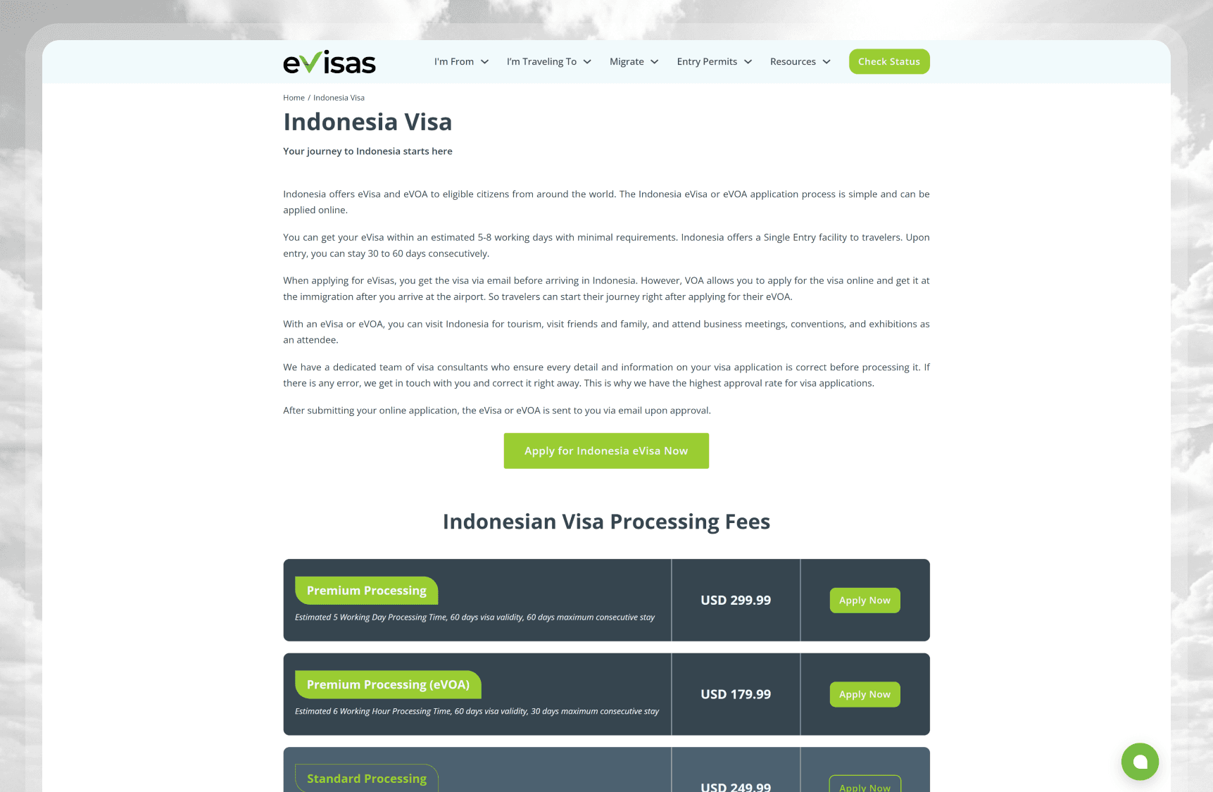
Before exploring solutions, I wanted to understand the problem from two different perspectives.
First, I analyzed how visitors behaved on destination landing pages to identify why so many users abandoned their journey before starting a visa application.
Second, I worked with internal stakeholders to understand the operational challenges behind maintaining and scaling more than 100 destination pages. These complementary research activities helped ensure the redesign would improve both customer experience and the team's publishing workflow.
Desk Research
The destination landing pages already performed well in attracting organic traffic, indicating that SEO was not the primary issue. However, Google Analytics revealed a significant drop-off of approximately 72%, meaning most visitors left without progressing to the visa application flow.
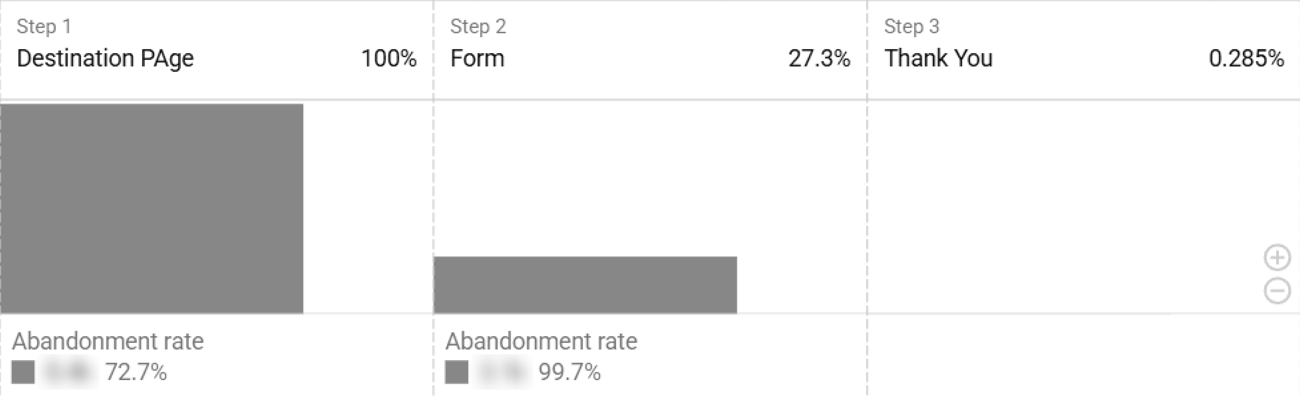
To understand where users disengaged, I combined funnel analysis in Google Analytics with session recordings and heatmaps from Microsoft Clarity. Rather than looking solely at conversion metrics, I focused on how visitors interacted with the page during their first impression.
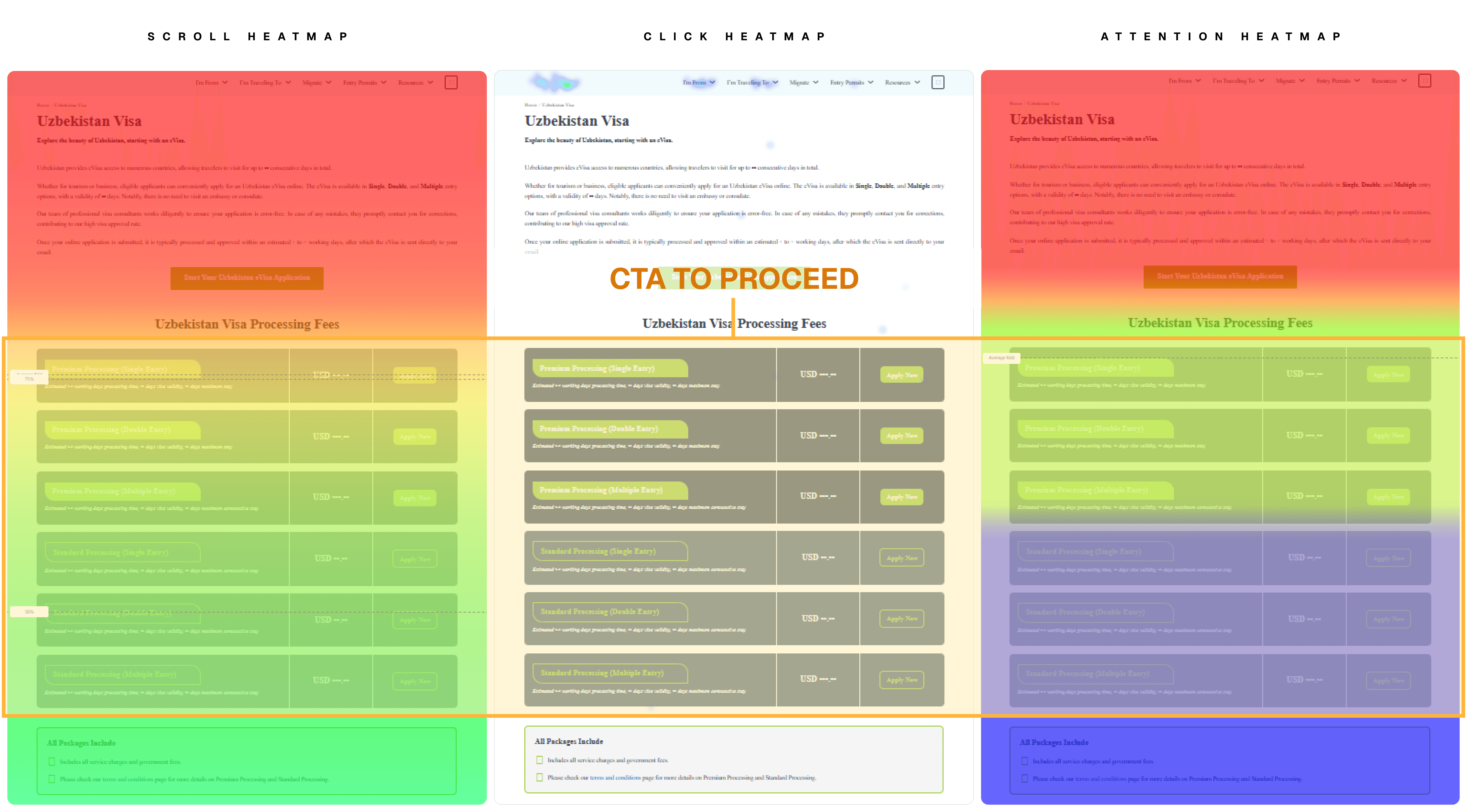
Several consistent patterns emerged:
Most visitors did not scroll far enough to reach the primary call-to-action.
Engagement dropped sharply after the introductory section, which consisted of a long text-heavy paragraph with minimal visual hierarchy.
Heatmaps showed very limited interaction around the existing call-to-action, suggesting that many users either never noticed it or lost interest before reaching it.
Above-the-fold content lacked a compelling visual element that could immediately reinforce the excitement of traveling to the selected destination.
These findings suggested that the issue was less about the information itself and more about how it was presented. The landing page needed to capture attention immediately, communicate value faster, and make the application journey visible throughout the browsing experience.
Content-Team Interview
Improving conversion was only one side of the problem. Even if a better landing page structure was introduced, the solution needed to be practical for the content team responsible for maintaining more than 100 destination pages.
To better understand their workflow, I interviewed the Content Specialist who managed destination page creation and updates. Rather than discussing design preferences, the conversation focused on how pages were produced, where the bottlenecks occurred, and what would be required to complete the upcoming migration within a tight deadline.
The interviews revealed that WordPress itself was not the limiting factor. Instead, the existing block-based editing workflow required content creators to manually assemble every page section by section before reviewing the final result. Repeating this process across more than 100 pages would require significant manual effort and make the migration timeline difficult to achieve.
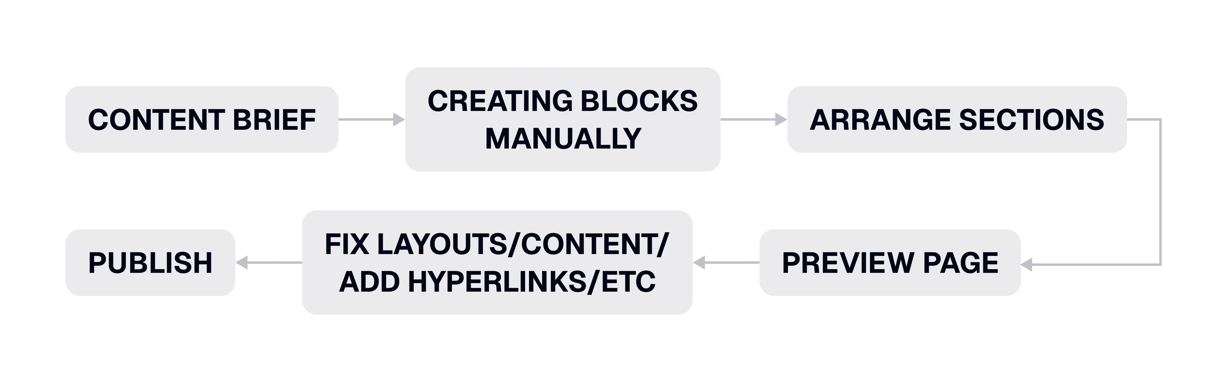
Several key pain points emerged:
Every landing page had to be assembled manually using individual content blocks.
The editing experience made it difficult to maintain consistency across hundreds of pages.
Previewing the final page required switching between editing and preview modes, slowing iteration.
The team needed a faster way to build new pages without sacrificing flexibility for future content updates.
These insights shifted the project from simply redesigning a landing page into designing a scalable content system. The solution would need to improve the visitor experience while also reducing the operational effort required to publish and maintain destination pages.
As a traveler, I need destination pages that help me understand the visa process and encourage me to apply because the current experience loses my attention before I reach the application, so I can complete my travel planning with confidence.
and
As a content specialist, I need a faster and more consistent page creation workflow because manually assembling each landing page limits our ability to scale, so I can efficiently publish and maintain destination content.
Design Decisions
The research revealed two interconnected challenges: visitors were abandoning destination pages before reaching the visa application, while the content team struggled to efficiently create and maintain a growing library of landing pages. Rather than treating these as separate problems, I approached them as parts of the same experience. My design decisions focused on improving the customer journey, creating a scalable content architecture, and building a publishing workflow that enabled the team to deliver and maintain content efficiently at scale.
Reimagining the Landing Page Experience
The research showed that visitors rarely reached the original call-to-action because it was positioned below a long block of introductory text. Instead of making incremental UI adjustments, I redesigned the entire landing page structure to surface the most important information as early as possible and keep the application journey visible throughout the experience.
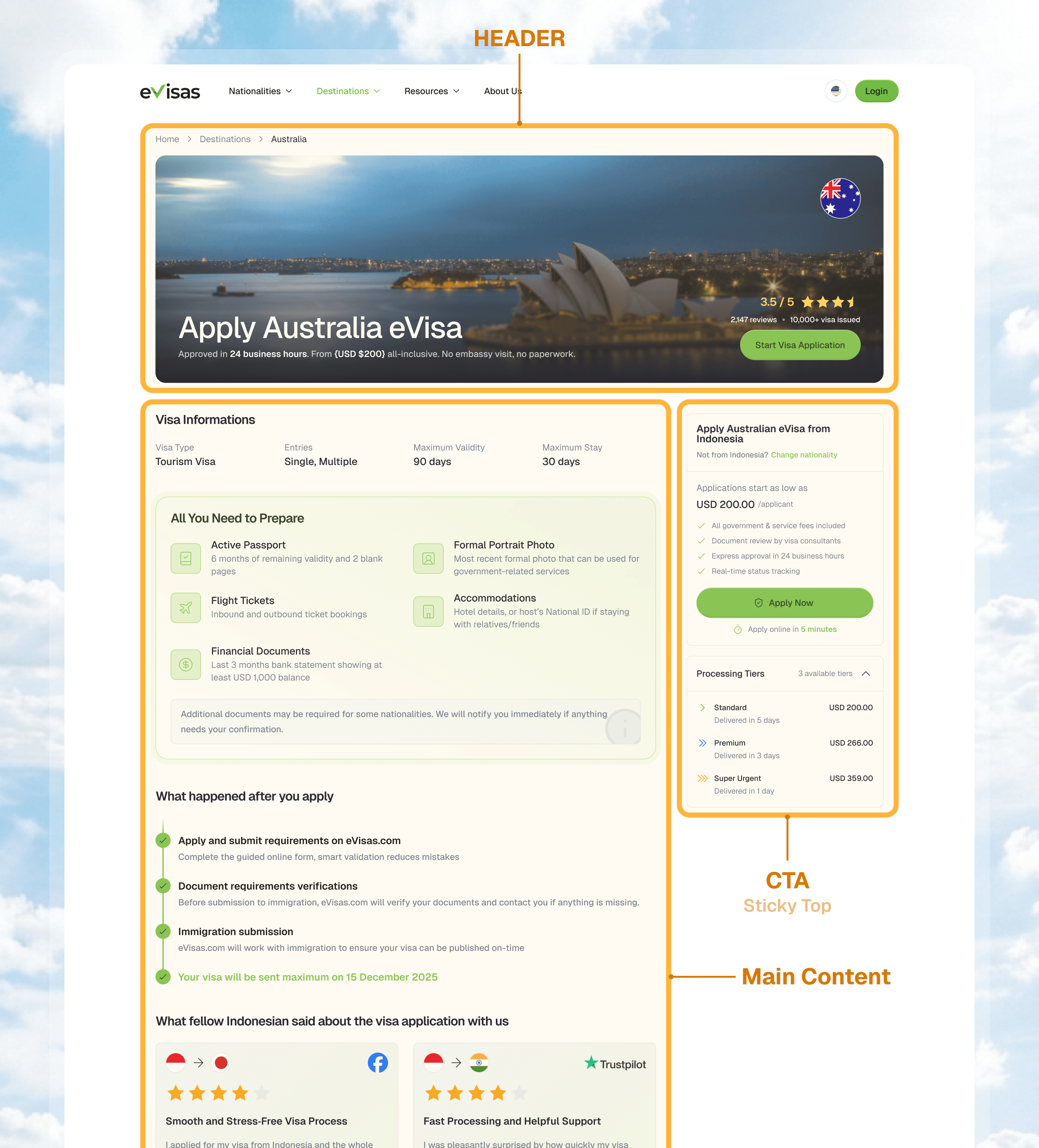
The new layout is divided into two primary areas: a Header that immediately communicates the page's value proposition, and a Content area that balances detailed information with persistent conversion opportunities.
The header was redesigned to answer visitors' most important questions at a glance. Alongside the destination title (H1) for SEO, it highlights key decision-making information such as the fastest visa processing time, starting price, and platform rating. These values are dynamically populated from the product database, ensuring every destination page remains accurate without requiring manual updates.
Below the header, the content area is organized into two columns. The main column contains destination-specific information curated by the Content Team, while the side panel remains visible as users scroll, providing continuous access to the visa application entry point, nationality selector, available visa packages, and processing time. This persistent layout reduces the effort required to start an application, regardless of where users are within the page.
Designing a Modular Content System
Creating a better landing page experience solved only part of the challenge. The content team still needed an efficient way to produce and maintain more than 100 destination pages without rebuilding each one from scratch.
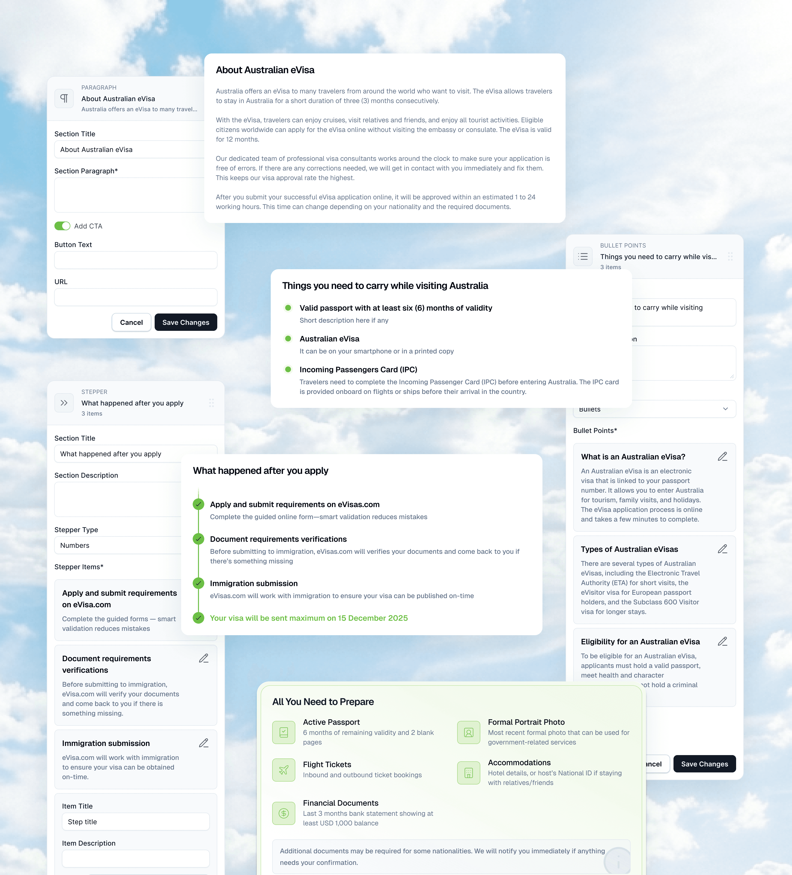
Instead of treating every landing page as a unique design, I transformed the content area into a library of reusable sections that editors could assemble based on each destination's needs. These modular components included rich text paragraphs, eligible nationality lists, document requirements, comparison tables, customer reviews, application steps, stepper cards, embedded media, HTML blocks, and other content patterns frequently used across destination pages.
Many of these sections were designed to automatically retrieve information from existing product data and internal services. For example, document requirements could be populated directly from the application data source, eliminating repetitive manual work while ensuring consistency across pages. At the same time, every automatically generated field remained editable, allowing the content team to adapt information whenever destination-specific content required greater flexibility.
By combining automation with editorial control, the system accelerated page creation without limiting the team's ability to produce rich, destination-specific content.
Reinventing the Content Publishing Workflow
The final piece of the solution focused on the content team's day-to-day workflow. Beyond improving the landing page itself, I wanted to reduce the operational effort required to create, review, and publish destination pages.
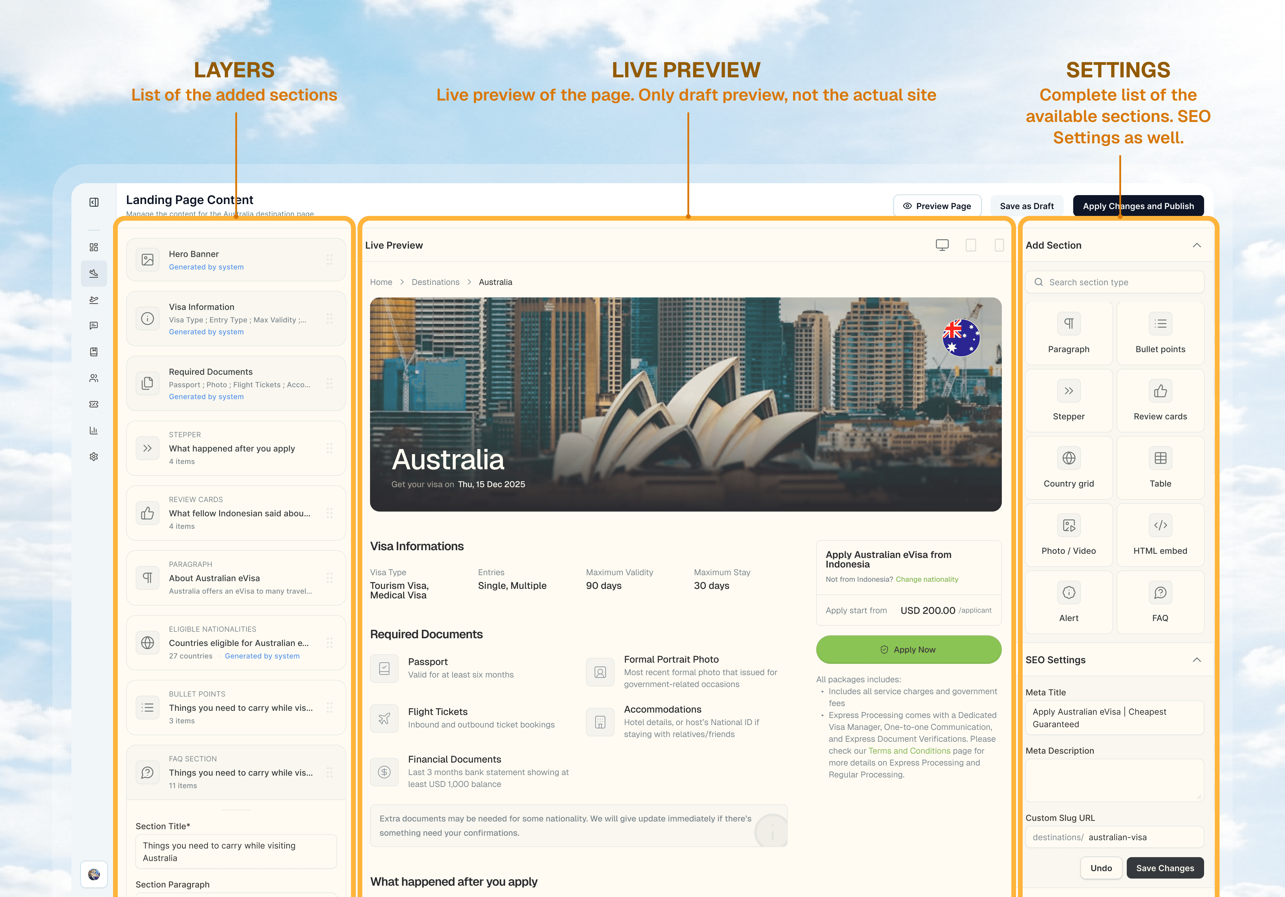
The CMS interface was redesigned into a three-column workspace that keeps editing and reviewing in a single screen. Editors can manage the page structure through a layer panel, see real-time changes in a live preview, and quickly add new content sections from a dedicated component library. This eliminated the constant switching between editing and preview modes that previously slowed iteration.
Recognizing that destination pages directly influence revenue, I also introduced a draft workflow that allows content to be reviewed before publication. This additional step gave the team greater confidence when making updates to high-impact pages while maintaining an efficient publishing process.
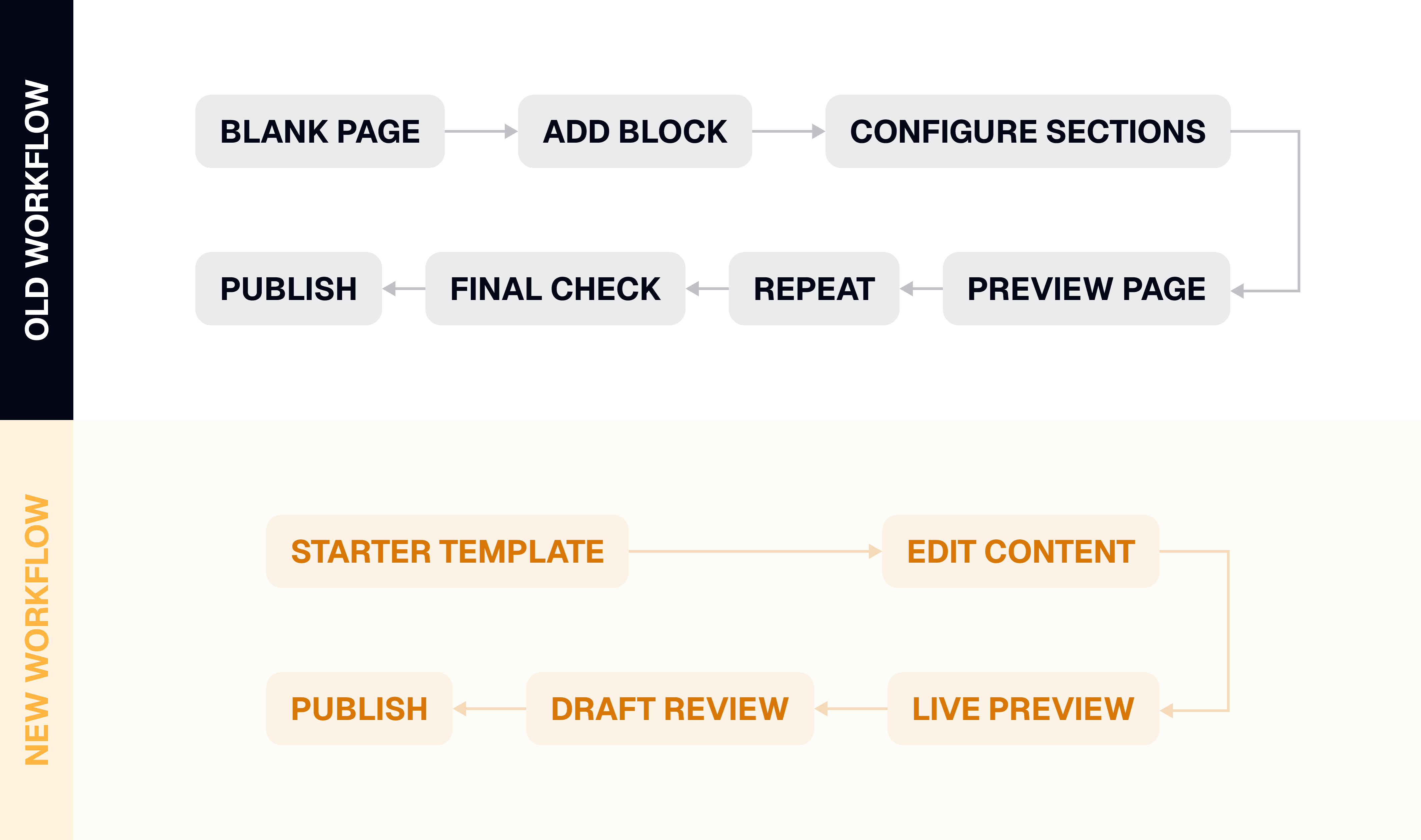
To further accelerate production, I created starter templates for every destination page. Rather than beginning with an empty canvas, editors could start from a predefined page structure and focus solely on tailoring the content to each destination. Combined with reusable sections and automated data, this significantly reduced setup time and played an important role in enabling the team to migrate more than 100 landing pages within the project timeline.
Outcomes
The success of this project wasn't measured solely by the redesigned interface. Since the initiative addressed both the customer experience and the internal publishing workflow, I evaluated its impact from three perspectives: business performance, operational efficiency, and long-term scalability.
Business Outcome
The redesigned landing page significantly improved how visitors progressed through the visa application journey. By surfacing key information earlier, keeping application actions visible throughout the page, and reducing friction in the browsing experience, destination page drop-off rates decreased from over 70% to approximately 40%.
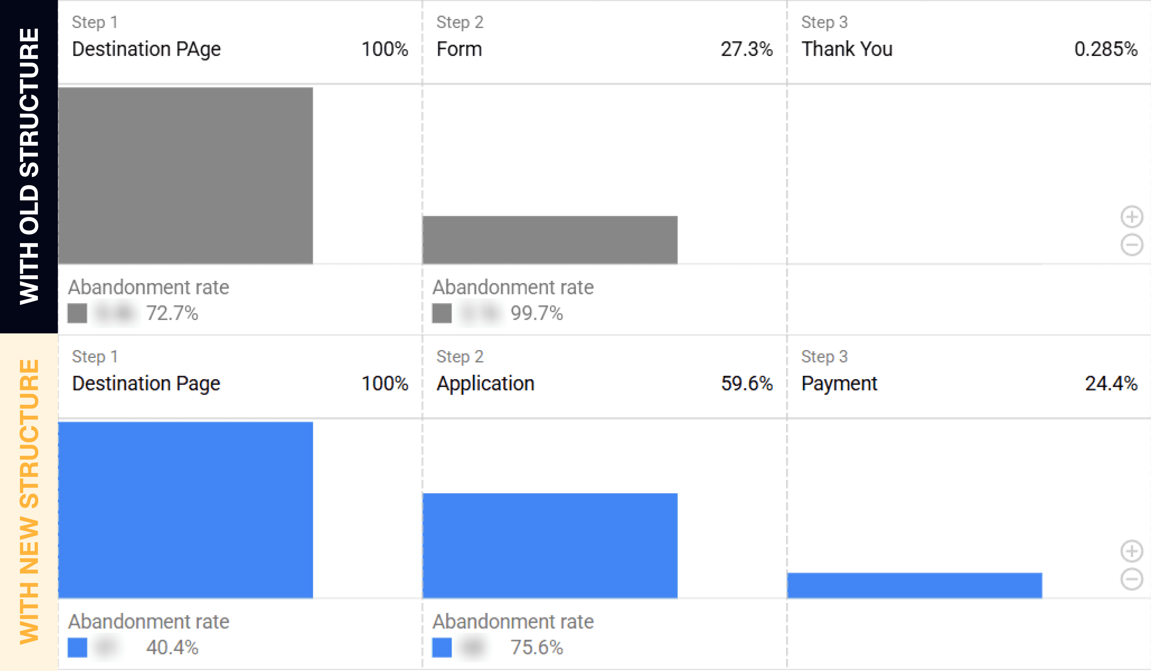
This improvement meant that more visitors continued into the visa application flow, increasing the opportunity for completed applications and supporting the company's revenue objectives. While multiple factors contribute to conversion performance, the new landing page structure established a stronger foundation for turning organic traffic into business outcomes.
Operational Outcome
Before | After |
|---|---|
Build every page manually | Start from template |
Assemble blocks | Choose from pre-created sections |
Separate preview | Live preview |
Slow iteration | Faster updates |
The redesigned landing page significantly improved how visitors progressed through the visa application journey. By surfacing key information earlier, keeping application actions visible throughout the page, and reducing friction in the browsing experience, destination page drop-off rates decreased from over 70% to approximately 40%.
This improvement meant that more visitors continued into the visa application flow, increasing the opportunity for completed applications and supporting the company's revenue objectives. While multiple factors contribute to conversion performance, the new landing page structure established a stronger foundation for turning organic traffic into business outcomes.
Reflection & Trade-offs
While the redesign successfully improved conversion performance and streamlined content operations, it also introduced new challenges. Because the migration involved changes to both the content structure and the underlying platform, some destination pages experienced a temporary decline in organic search performance after launch.
Rather than viewing this as a failure, the team recognized it as the next phase of the product's evolution. With a scalable content platform now in place, future efforts could focus on refining content quality, recovering SEO performance, and continuously optimizing landing pages without being constrained by the previous publishing workflow.
" height="20px" id="nI7FUoXPE" transform="translate(2 2)" width="20px"/></svg>)
" height="18.599999999999994px" id="FDJfVDwST" transform="translate(2.7 2.7)" width="18.599999999999994px"/></svg>)
" height="16.803750000000008px" id="hJbYoYIUX" transform="translate(3.6 3.6)" width="16.80000301949815px"/></svg>)
" height="14.400003051757778px" id="cPCyOUUsV" transform="translate(2.4 4.8)" width="19.199999999999996px"/></svg>)