
The Trust-First Transformation: Re-engineering the Global Visa Experience
eVisas
Figma
Efficient User Flow
Conversion Boost
User Research
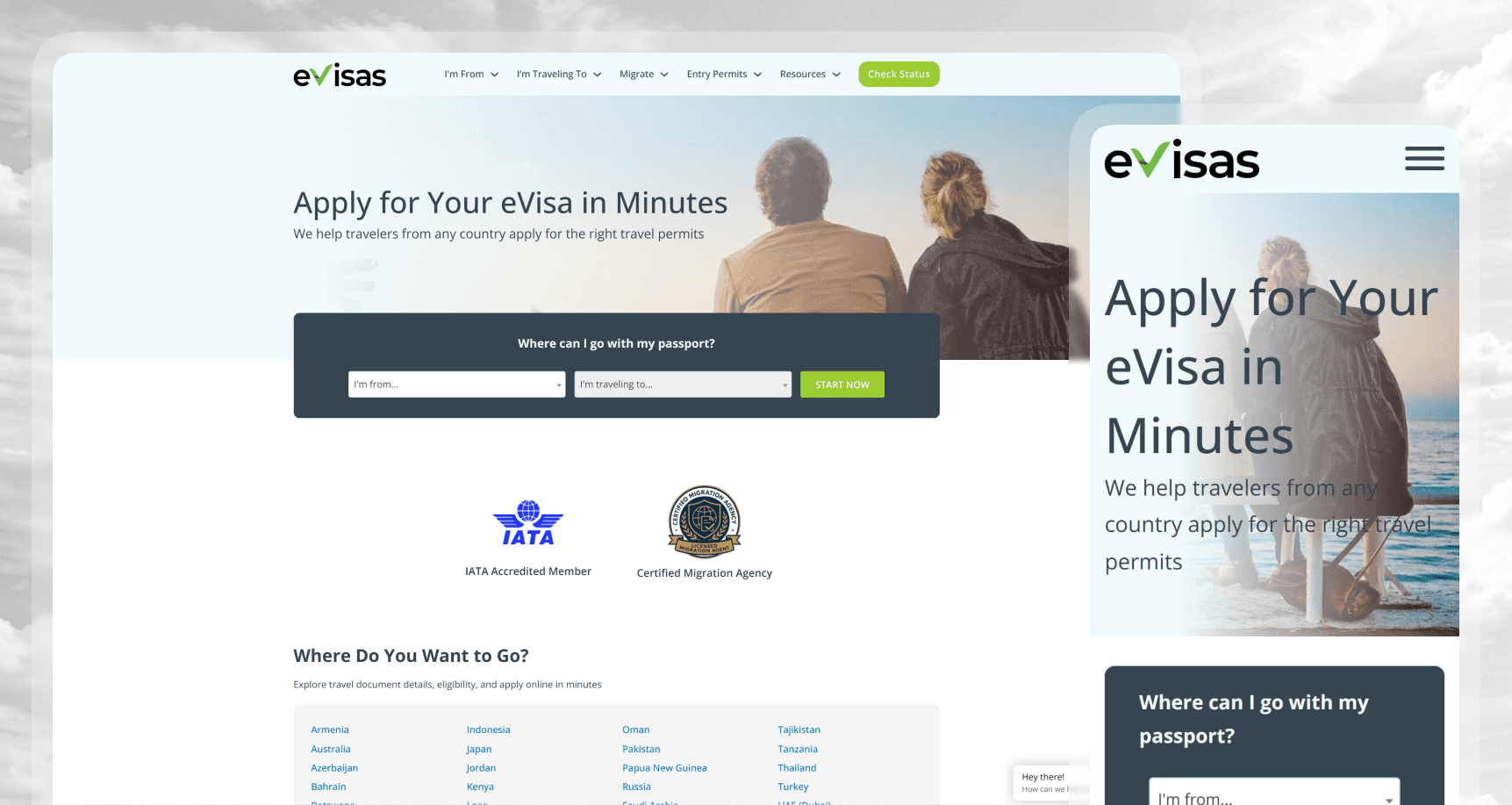
eVisas.com is a unified platform designed to simplify the labyrinth of international visa applications.
This project involved a complete architectural overhaul, transitioning from a fragmented, legacy WordPress-based web-app to a high-performance, native mobile ecosystem. By identifying "trust" as the primary user barrier, I led a redesign focused on Anticipatory Design—implementing OCR passport parsing and a persistent "Identity Vault."
The result moved the needle from a "one-off" form-filling tool to a secure, reusable travel companion, significantly reducing user friction and increasing long-term platform loyalty.
The Problems
Bridging the "Legitimacy Gap"
Through a comprehensive Heuristic Evaluation of the existing WordPress-based platform, I discovered a critical psychological barrier: The "Legitimacy Deficit." In the high-stakes industry of international travel, users are required to share sensitive personal data and payment information.
The original site, built on generic WordPress templates and GravityForms, triggered "scam" red flags for modern users. My research indicated that an outdated visual language directly correlated with high abandonment rates at the payment gateway. Users weren't just struggling with the UI; they were afraid of the platform’s intent.
Professionalizing the aesthetic wasn't just a "makeover"—it was a Conversion Rate Optimization (CRO) necessity.
Analyzing the "Redo" Loop
Diving into user behavior analytics, I identified a recurring failure in the "Persistence Layer." The legacy system relied on browser sessions that lacked state management. If a user was interrupted—which is common for visa applications requiring external documents—their progress was wiped. This created a "Redo" loop, forcing users to manually re-type complex data multiple times.
This Cognitive Load was the leading cause of user frustration. My research confirmed that users didn't want a "prettier" form; they wanted a system that respected their time and remembered their progress across multiple sessions and devices.
The user that using the legacy web platform needs a secure mobile experience that eliminates repetitive manual entry and establishes immediate institutional trust, so they can apply the visa easily without friction and worrying the outcomes.
The Concept
During the discovery phase, I weighed two distinct architectural paths:
The Optimized Form Path
Refining the existing UI components and breaking the long-form into a multi-step wizard. While safer, this didn't solve the core data-entry problem.The Automated Identity Path (The Choice)
Integrating OCR (Optical Character Recognition) technology to allow for automated passport parsing.
The Decision
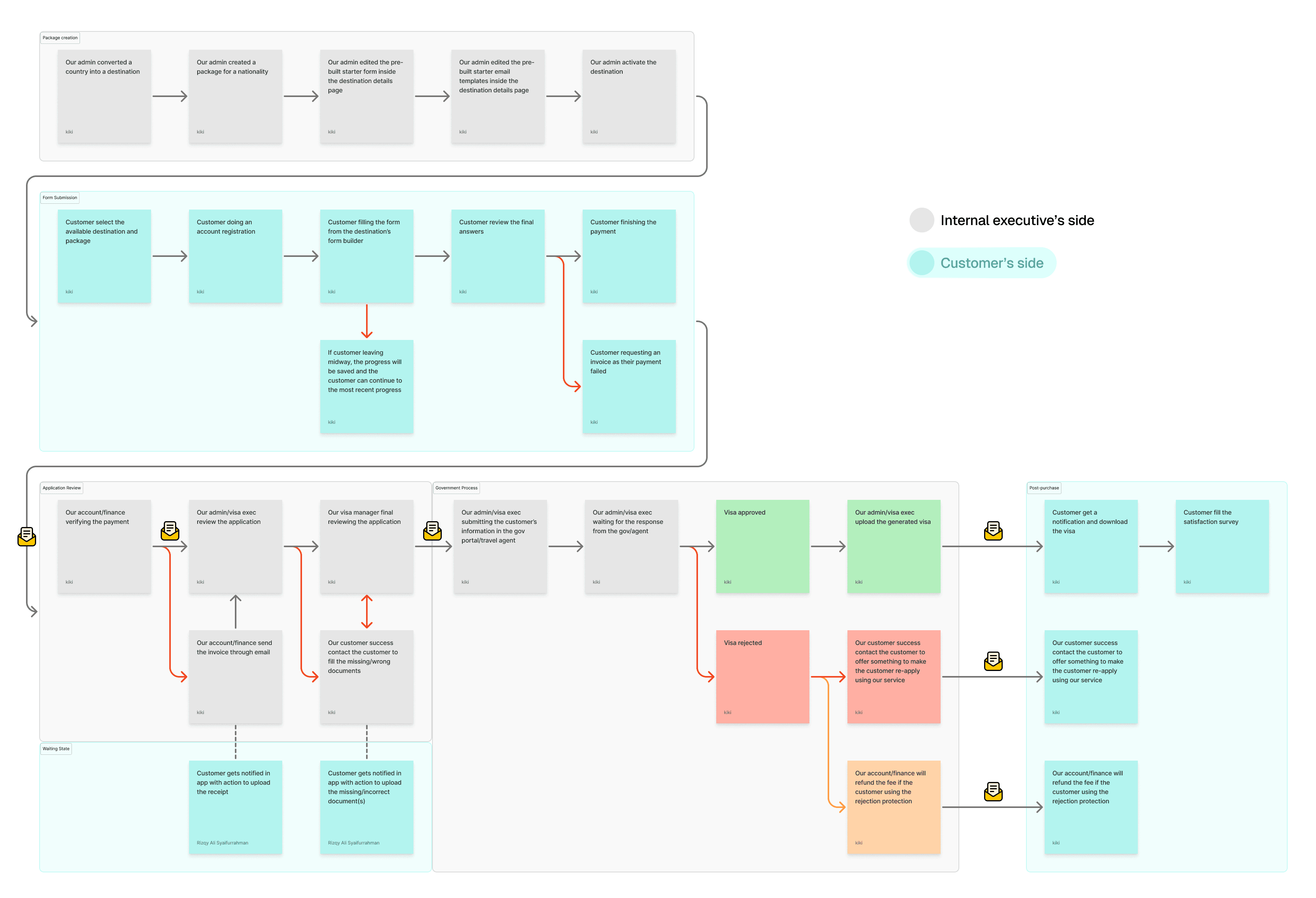
Beyond the automation of data, I made a critical strategic pivot: Asynchronous Document Submission. Instead of a rigid, linear flow that blocked progress until every document was uploaded, I architected a system that allowed for "Skipped States."
The User Experience → Intent-Based Progress
We recognized that users often start a visa application without having every physical document (like a specific bank statement or photo) on hand. To prevent "Session Fatigue," we allowed customers to bypass missing documents and complete the rest of the application.
The Strategy: To maintain momentum, we implemented a "Priority Notification" system.
The Outcome: This gave the user freedom while retaining a Sense of Urgency through persistent in-app "Incomplete" badges and automated reminders, ensuring the deadline remained top-of-mind without being a blocker.
The Internal Challenge → Logic Alignment
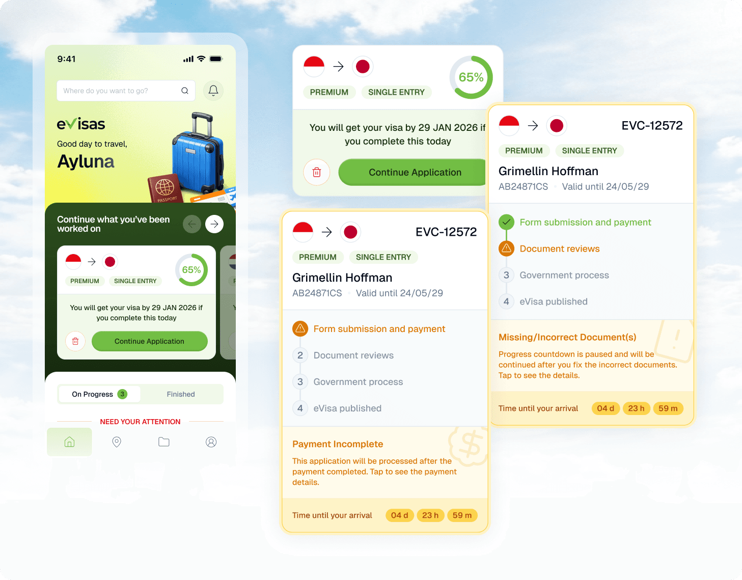
Allowing "incomplete" applications created a potential bottleneck for the internal team. I solved this by designing a Tri-State Lifecycle Architecture that synchronized the Customer App with the Admin Dashboard. This ensured that the internal team only spent resources on "Actionable" orders while clearly flagging those "Pending User Input" by something like "PAUSED".
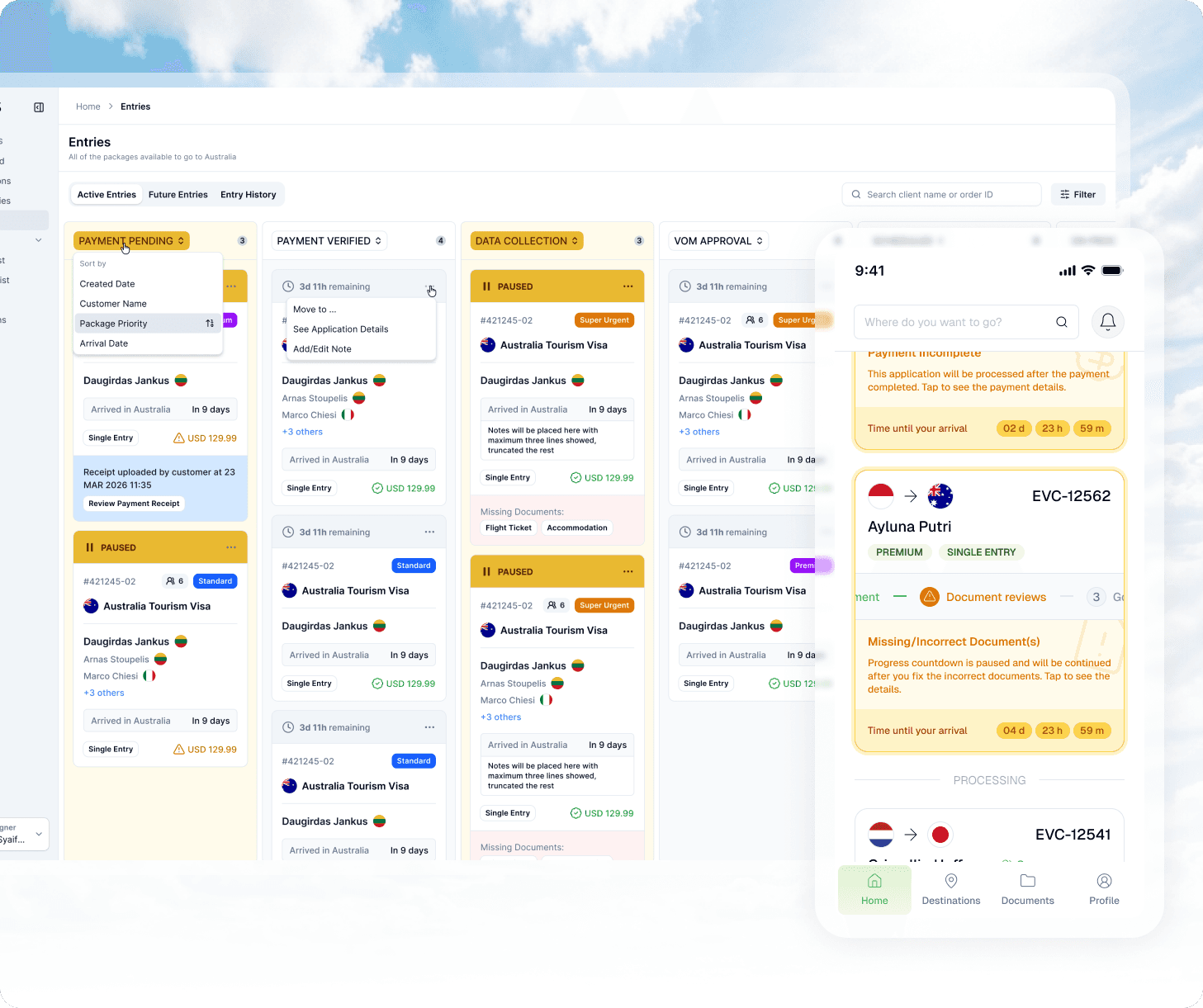
The Application Lifecycle Flow
Stage 1: Pre-Process | Initial verification of parsed identity data.
Stage 2: Application Filling | The "Flex-State" where data is gathered and documents are uploaded asynchronously.
Stage 3: Processing (The Critical State) | Once the user "Commits," the application moves into this most important phase for both parties, locking the data for official government submission.
Visuals
The visual strategy was built on the pillar of "Visual Trust." I transitioned the design system away from web-centric components to a Native Mobile Language. This included a high-contrast typography scale for readability, a professional yet lite "Lime Green" color palette, and subtle haptic feedback to confirm successful data parsing.
I focused heavily on "Affordance"—ensuring that the scanning interface felt tactile and secure, mimicking the experience of a high-end banking or travel app.
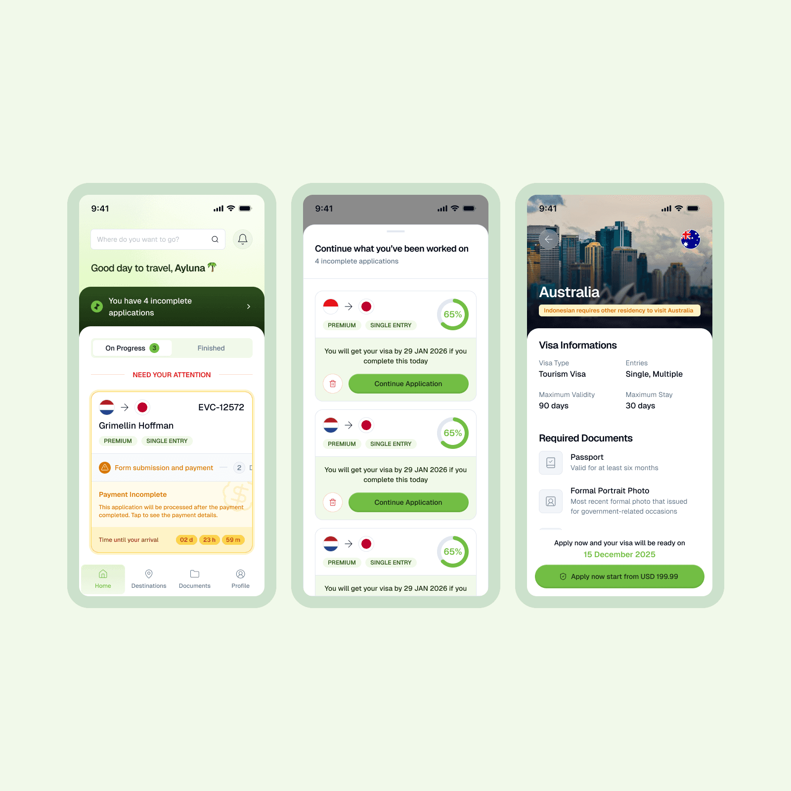
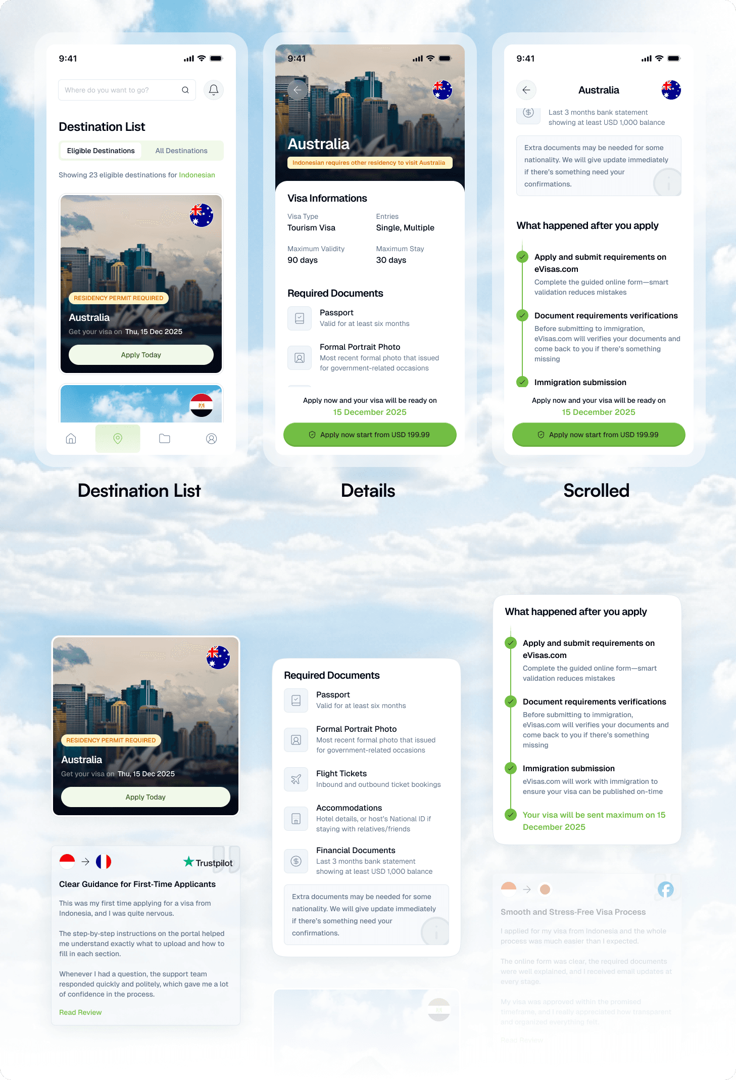
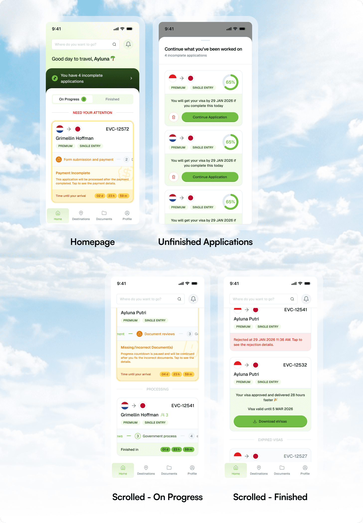
Homepage - Action-Oriented Contextual Hierarchy
The core philosophy behind the homepage redesign was Anticipatory Design—predicting what the user needs the moment they open the app. Rather than presenting a static menu, the UI adapts to the user's current application state.
The Strategy - Priority-First Disclosure: We moved away from "fluff" content, instead surfacing high-stakes actions like form completion and urgent blocker resolution at the very top of the scroll.
The Goal - Frictionless Completion: By centering the experience on "What needs my attention now?", we transformed the homepage from a passive landing screen into an active productivity tool that drives the user toward a successful visa submission.
Destinations
To solve for the complexity of global visa regulations, I transformed the Destination List into a Dynamic Relevance Engine. By leveraging the user’s stored profile—specifically nationality and residency status—the interface automatically filters for 100% eligible destinations. This prevents "Dead-End Friction" and choice paralysis, ensuring that as the platform scales its global coverage, the user only interacts with viable paths tailored to their specific legal identity. It effectively turns a global directory into a curated, personal travel menu.
For the Destination Details, the strategy shifted toward Information Synthesis and Temporal Assurance. I modularized high-stakes data—including eligibility criteria, entry limits, and required documentation—into a scannable "Single Source of Truth" to reduce cognitive load. To provide immediate psychological safety, I implemented a Dynamic Completion Estimate, showing the exact date a visa would be finalized if started today. This transparency replaces regulatory anxiety with a predictable, professional timeline that reinforces the value of our service and drives immediate conversion.
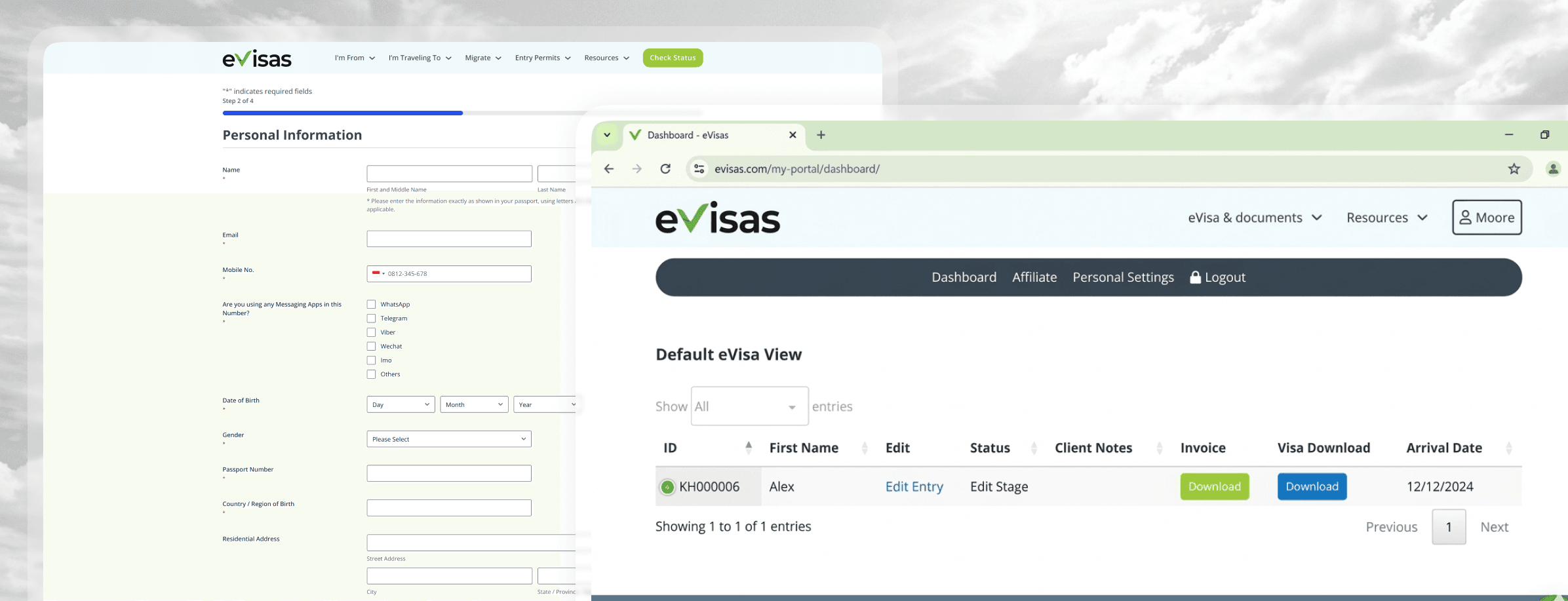
Application Form
To accommodate the high volume of family and religious travel (such as Umrah or Hajj), I overhauled the application logic to support a Multi-Applicant Architecture. I moved away from a single, exhaustive form toward a modular "Applicant Dashboard" where users can manage multiple profiles in one session. This system dynamically pulls unique, destination-specific forms from our internal admin system, ensuring that while the management interface is unified, the data collected remains 100% compliant with varying government requirements.
I intentionally designed a Strategic Pacing Buffer—a deliberate "pause" between form completion and the payment gateway. In high-stakes visa applications, the transition to payment can trigger significant "Transaction Anxiety." By introducing a dedicated review state, I provided users with a psychological reprieve to audit their data and rest before committing to the final step. This Cognitive Pacing ensures the user feels in control and confident, reducing the likelihood of manual errors and abandoned carts at the most critical stage of the conversion funnel.
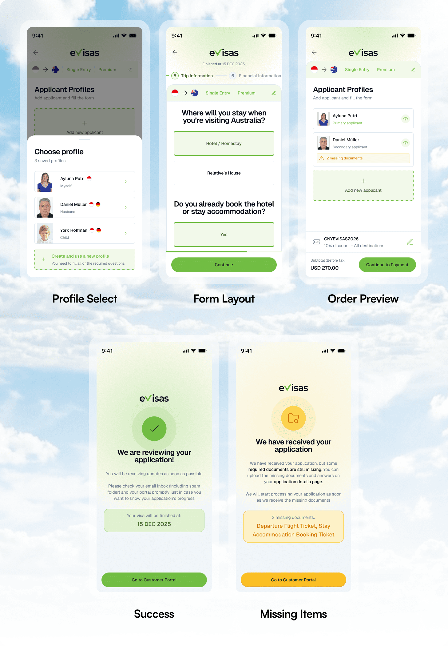
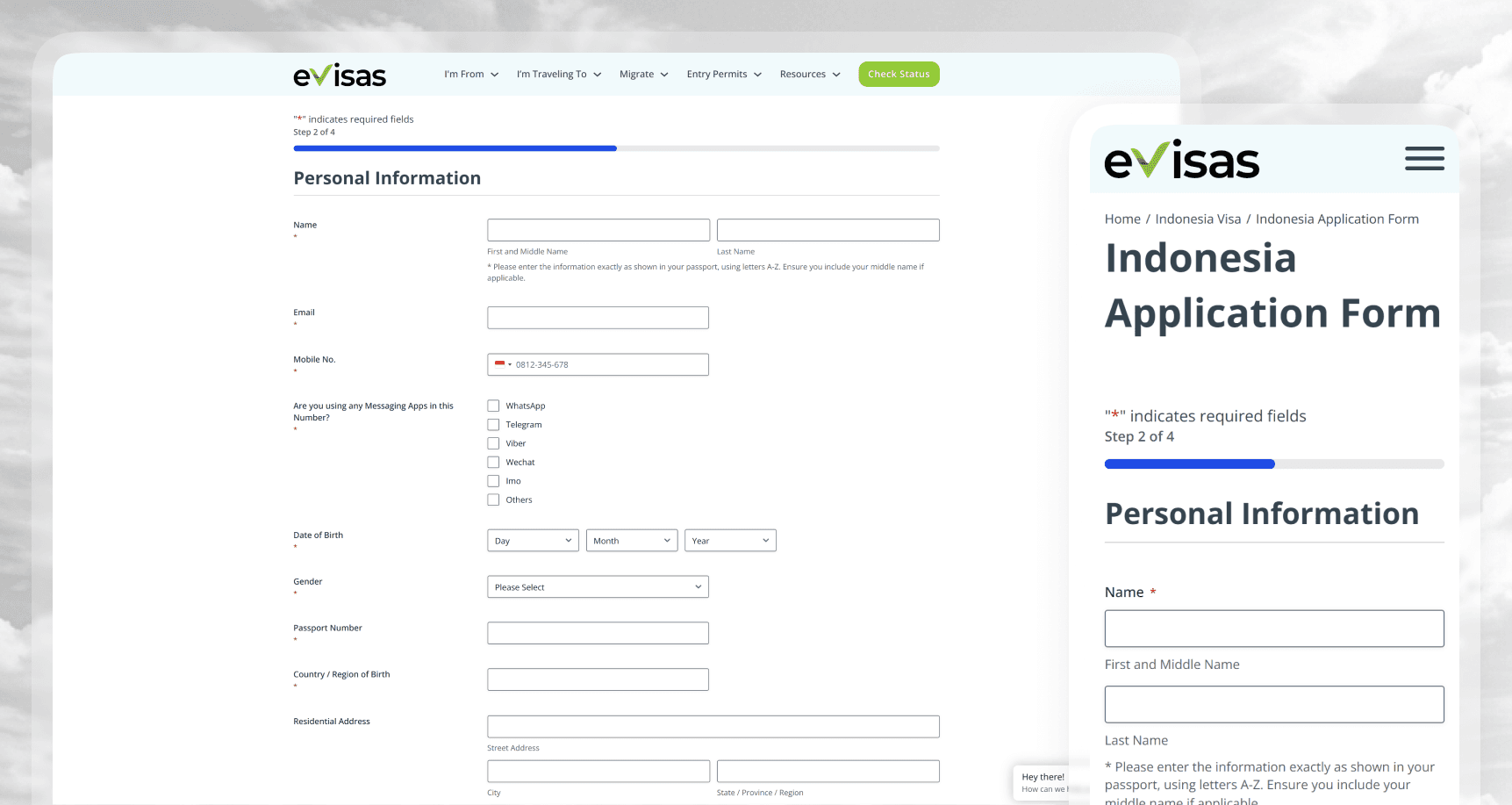
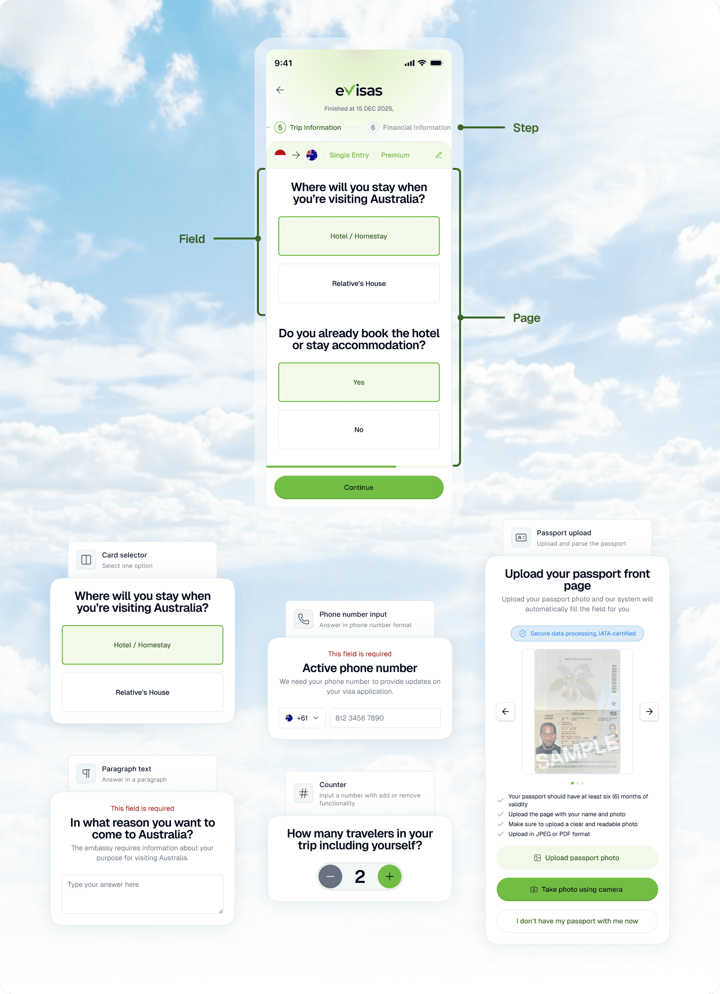
I also re-engineered the form’s Information Architecture from a flat structure into a 3-Layer Hierarchy: Steps | Pages | Fields. This shift was a strategic move toward Progressive Disclosure, ensuring that users are only presented with one thematic context at a time. By chunking exhaustive visa requirements into logical steps and pages, I eliminated the "Wall of Forms" effect that leads to high cognitive fatigue. This architecture prevents "Context-Jumping," allowing the user to remain in a focused flow state by completing one specific category of information (e.g., Personal Details or Travel History) before moving to the next.
This structural foundation also serves as the host for Anticipatory Design features, such as the OCR Passport Parsing tool. By layering the form, I could lead with "Zero-Input" automation—allowing users to scan their documents to instantly populate entire pages of data. This combination of a granular hierarchy and automated entry transforms a traditionally tedious government requirement into a streamlined, guided experience. The result is a faster "Time-to-Completion" and a significant reduction in the manual input errors that often lead to visa rejections.
Testings
Measuring the Automation Effect
I conducted a series of A/B Usability Tests comparing the legacy manual-entry method against the new OCR-enabled flow. The results were definitive: the automated approach reduced the average "Time to Completion" by 62%.
Qualitatively, users reported a significant reduction in "Input Anxiety"—the fear of mistyping critical government information. By removing the need to type long passport numbers, we didn't just save time; we increased the user's confidence in the final submission.
Stress-Testing System Persistence
To validate the "Auto-Save" function, I ran "Interruption Scenarios" where users were forced to exit the app at different stages of the application. 100% of participants successfully resumed their journey without data loss.
This testing phase was crucial in proving that "State Management" is a vital UX component in long-form applications. Users noted that the ability to "save and return" made the daunting task of a visa application feel manageable and modular rather than overwhelming.
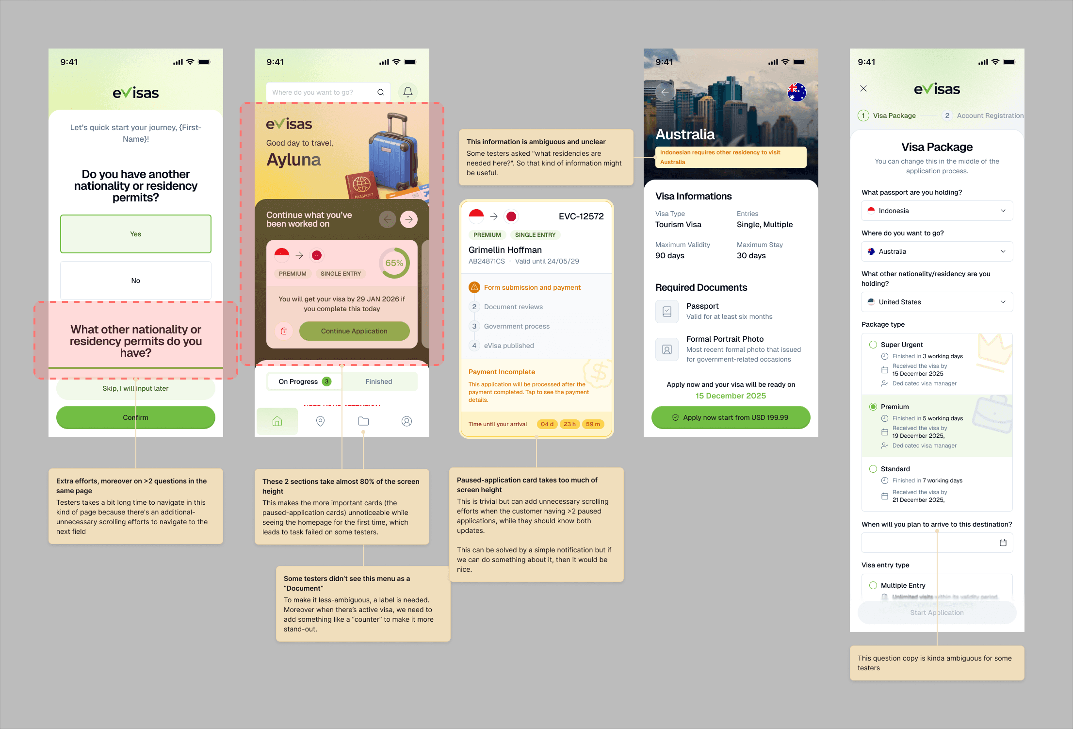
While the initial prototype validated our core logic, usability testing surfaced critical friction points regarding navigation hierarchy and information overload. The following insights led to several high-impact iterations:
Final Produced Design
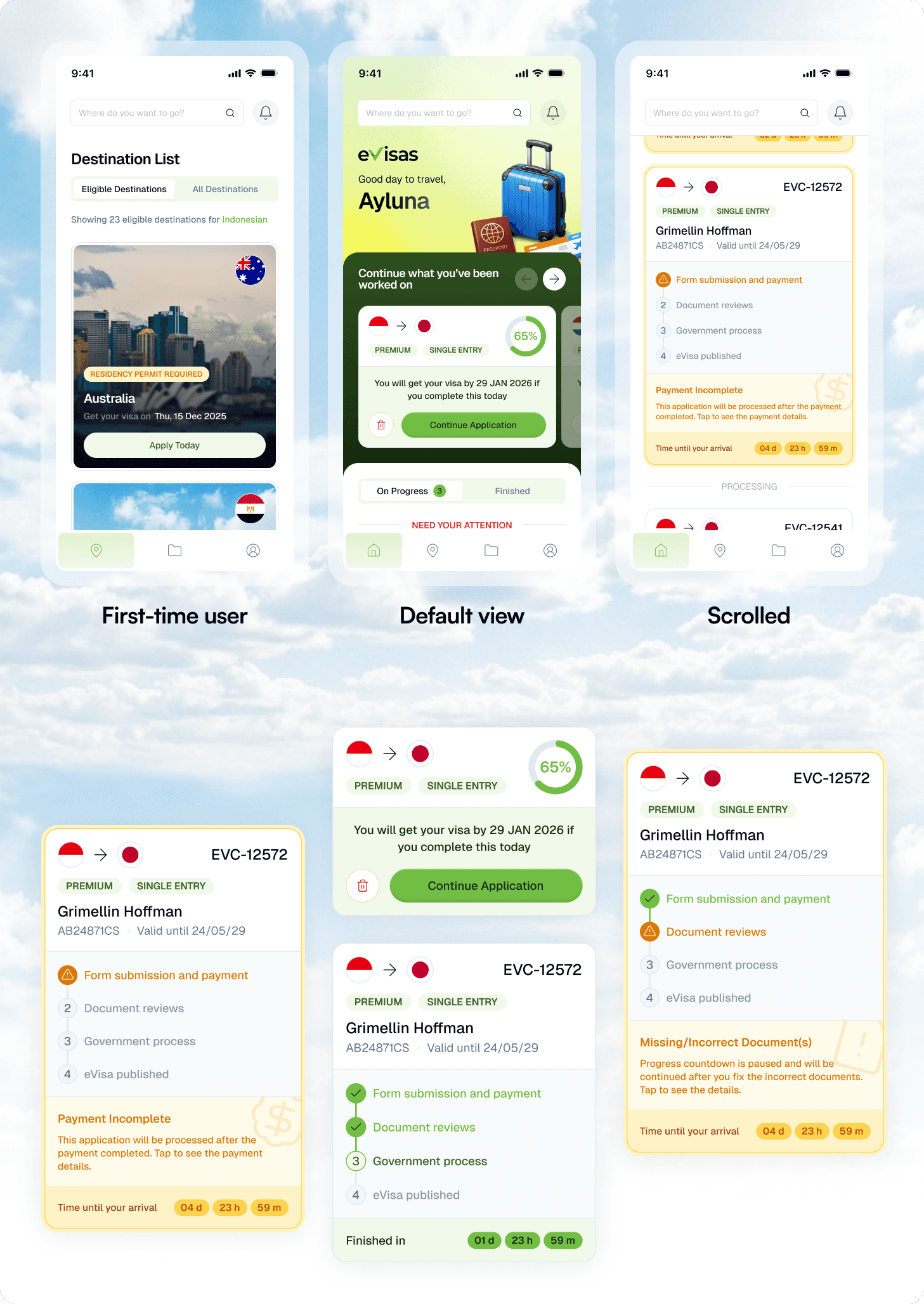
The transition from prototype to final production was guided by a commitment to Signal-to-Noise Ratio. Usability testing revealed that the initial homepage was trying to do too much at once. By analyzing user behavior, we discovered that the primary intent upon opening the app was Status Tracking (checking active progress) rather than resuming old drafts. Based on this, I made two major hierarchical shifts to the homepage architecture:
Card Simplification: I stripped away secondary data from the main application cards, surfacing only the most critical "Status Snippets." This allows users to get a high-level update at a glance, while moving granular details into a deeper layer of Progressive Disclosure.
Intent-Based Hierarchy by Collapsing Draft States: Feedback indicated that "Unfinished Applications" were consuming too much prime visual real estate. I restructured this section into a collapsed, secondary view. By minimizing the footprint of incomplete drafts, I cleared the path for the user’s primary goal—monitoring active visas—while ensuring the "resume" path remained prominent enough to be accessible.
Beyond these structural pivots, I implemented a series of Micro-Refinements, including sharpened copy for clarity and optimized touch targets. The final validation confirmed that the interface achieved a high benchmark for both Usability and Desirability. The resulting mobile ecosystem feels professional, secure, and—most importantly—responsive to the user’s immediate needs, making it fully ready for public release.
Impacts
Quantitative Growth
By migrating from a "scam-like" WordPress blog to a native, professional mobile experience, we saw a direct increase in the Form Completion Rate. The professional design language resolved the "Legitimacy Deficit," leading to a significant decrease in drop-offs at the final payment screen. We successfully turned "skeptical visitors" into "confident applicants."
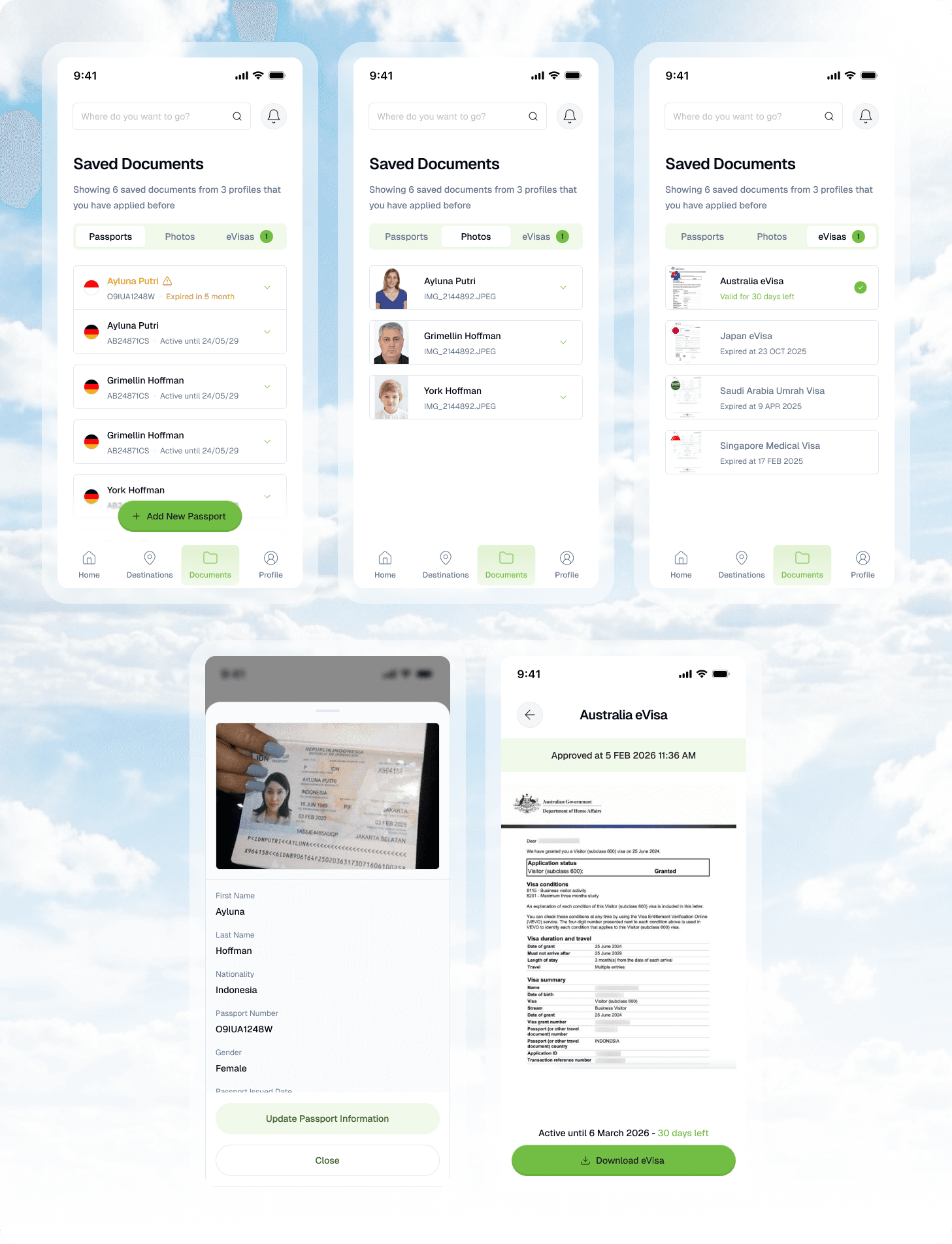
Creating an Ecosystem
The introduction of the Profile Vault fundamentally changed the user relationship with eVisas. By storing user data for future use, we saw a rise in Customer Lifetime Value (LTV). Users who applied for one destination were 40% more likely to return to the app for their next trip, knowing their data was already "vetted" and saved. We transitioned from being a one-time utility to a permanent travel companion.
We also envision integrating comprehensive travel companion tools like eSIMs, flight bookings, and more directly into our platform to build a thriving business ecosystem and create an all-in-one solution for international travel.
Retrospective
This project was a masterclass in Systemic Thinking. It taught me that UX Design is often about solving the problems the user doesn't see—like state management and data persistence. Moving away from a "WordPress mindset" allowed me to focus on high-level automation and technical integration. If I were to iterate further, I would explore Predictive Document Requirements, using the user's travel history to suggest which visas they might need next, further cementing eVisas as an essential travel hub.
" height="20px" id="nI7FUoXPE" transform="translate(2 2)" width="20px"/></svg>)
" height="18.599999999999994px" id="FDJfVDwST" transform="translate(2.7 2.7)" width="18.599999999999994px"/></svg>)
" height="16.803750000000008px" id="hJbYoYIUX" transform="translate(3.6 3.6)" width="16.80000301949815px"/></svg>)
" height="14.400003051757778px" id="cPCyOUUsV" transform="translate(2.4 4.8)" width="19.199999999999996px"/></svg>)